A Report on Publishing – Jonty Valentine
To the Committee,
This report is for your urgent consideration: I’m interested in us beginning to discuss a few things about the following project. I’d like to use it as the prompt to talk about (graphic design and) print publishing. Now, I know that we have come to a general agreement that the text (written content) should take precedence over the image (formal content) which should take precedence over the material (technical content), but I just thought that for the purposes of debate we might be able to make an exception here.
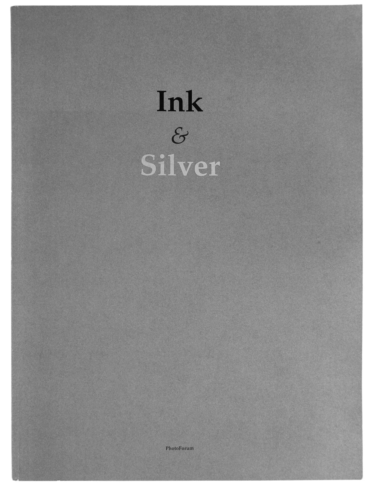
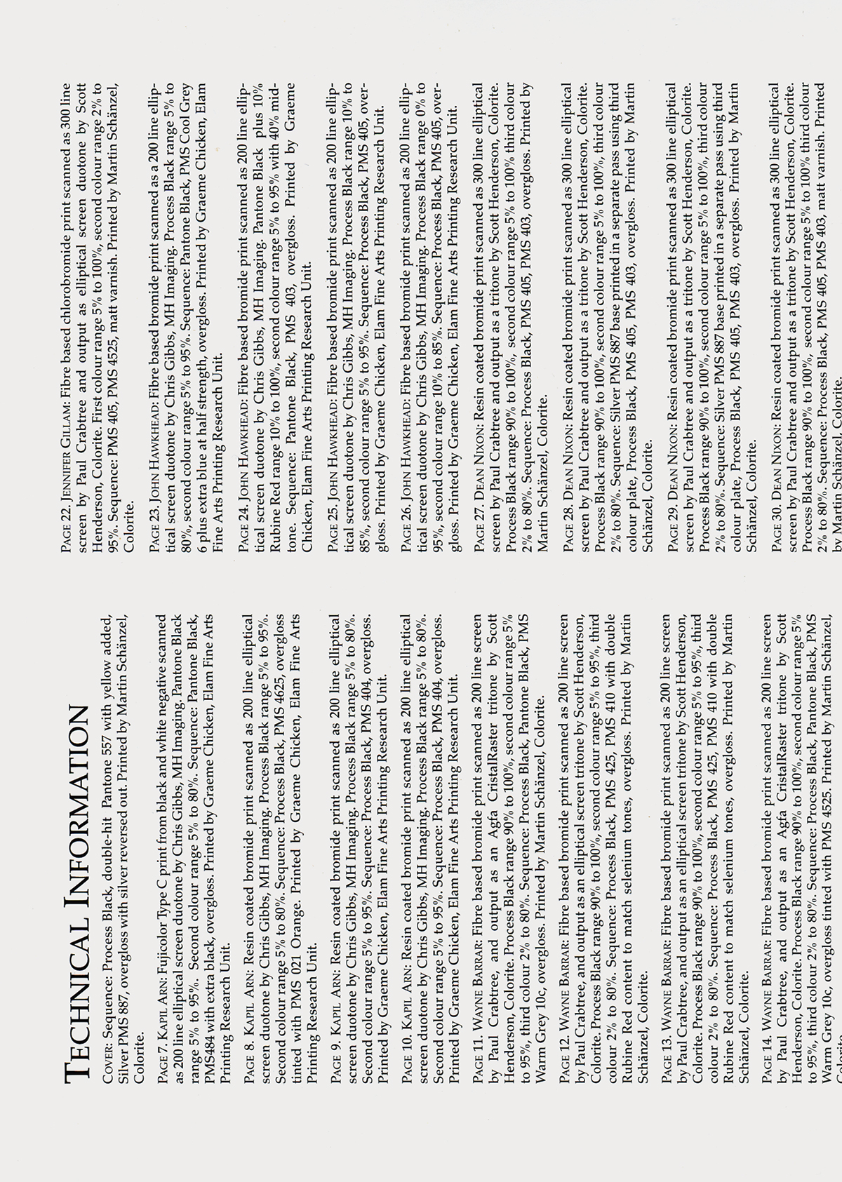
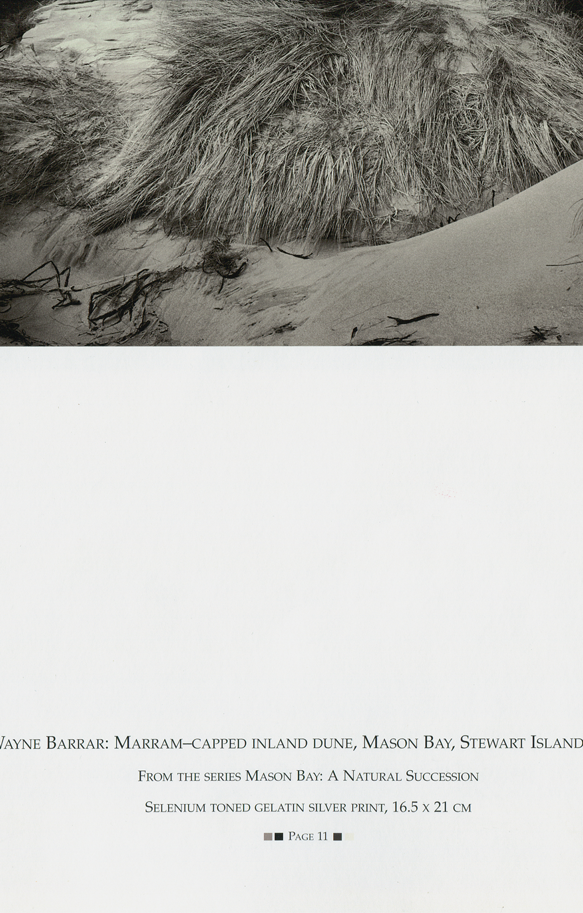
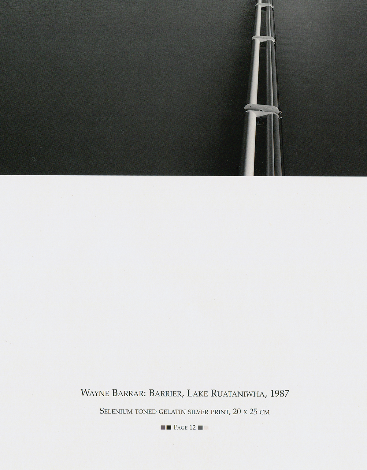
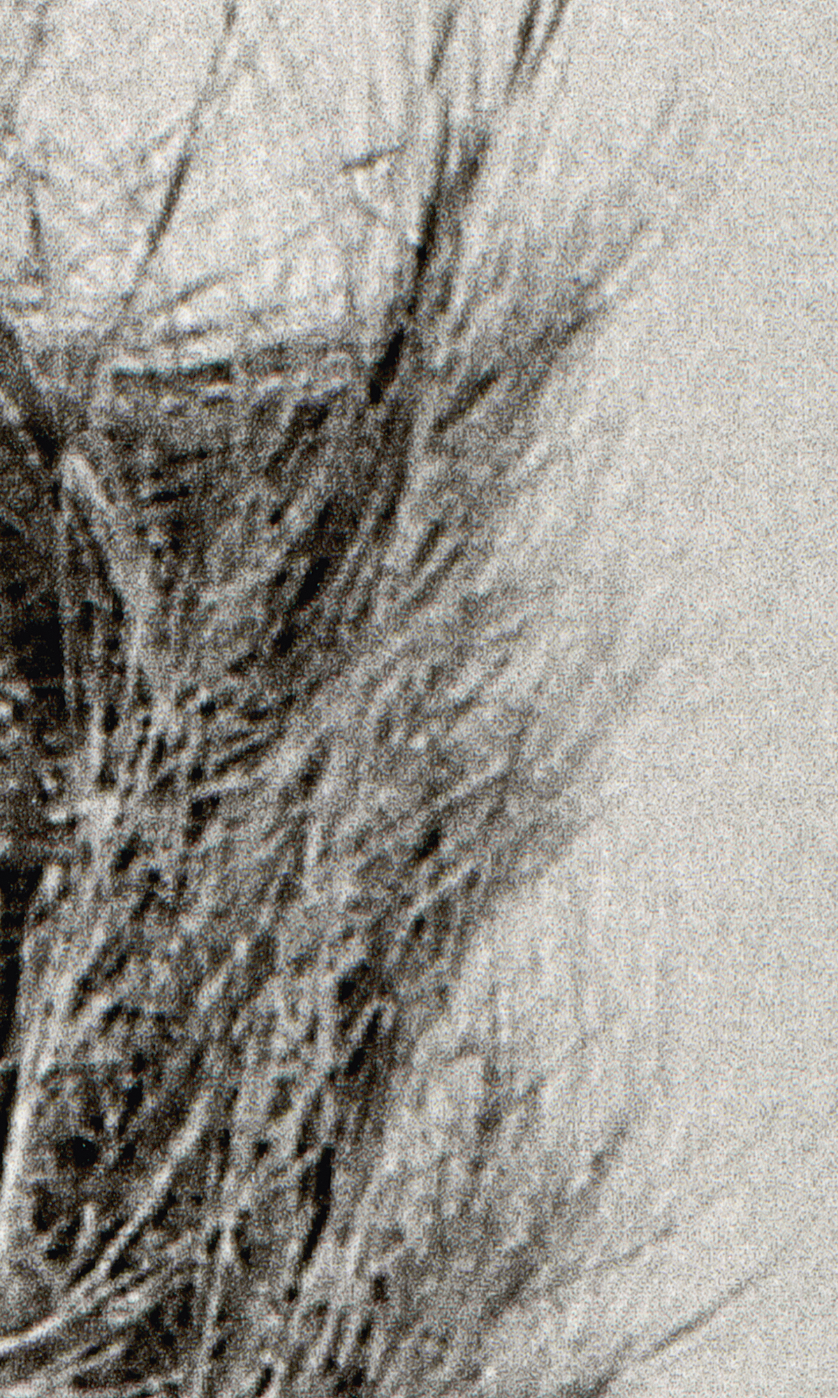
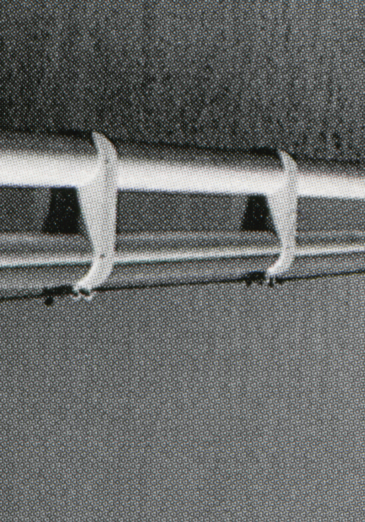
Quite a few years ago, in about 1997, I came across the publication Ink & Silver edited by John B. Turner. It is a large-format book of beautiful photographs. They are not so much beautiful in terms of their subject matter—even in their formal content—but beautiful because of the way they are printed.1 I still haven’t seen anything quite like it produced in this country, and can’t possibly do justice to it in any reproductions here, so let me try to describe it: Imagine if your aim was to perfectly technically correctly reproduce black and white photographs using offset print. The goal would be to try to simulate the full range of greys of a continuous-tone photograph, with the limitations of offset ink and printing technology (lets just agree for now not to complicate this with other print techniques like photogravure and collotype etc.). The result in Ink & Silver is a group of thirty-two duotone and tritone prints. Each image is printed with different combinations of black and grey inks. Some are printed with standard elliptical halftone screens ranging from 175 to 300 lpi and a number are printed with “Agfa Crystal Raster” random dot screens. Some for example with a warm mid-tone grey ink and two different colour blacks as well as a matte varnish fourth ink. Another with three black inks and tinted over-gloss [see page 83]. I imagine that the impossible ideal result may have been to hold up the original photo next to the print and for them to be identical.2
Alongside this study of printing technique, the other (and potentially more intriguing) story here is the circumstances in which this publication came about. The book and associated workshop was organised by the Elam Fine Arts Printing Research Unit (EFAPRU), and was initiated by Mr Turner3 and Robin Lush — Senior Lecturer and Design Technician, respectively, at Auckland University at the time. The archive of documents from the EFAPRU at the Elam library reads like a dramatic bureaucratic saga, scripted as a paper trail of internal memoranda from initial proposals, through to the setting up of the operation, then finally to the dissolution of the Unit — spanning almost ten years. The archive also happens to include (although apparently not from Mr Turner) part of a report on university publishing in New Zealand by Mr E. H. McCormick from 1963, entitled Report on Publishing and labelled in pencil ‘Pre-EFAPRU Background’. Of particular note here is a prediction about the potential for publishing books on ‘the almost virgin territory of New Zealand art’.4
Anyway, back to my story. And again, I know this is not what we normally do—that is, write about how something looks—it may be contradicting the agreed standard operating procedure but... The crux of the discussion I want to initiate is about the EFAPRU’s focus on technical craft and visual reproduction as content, and how this contrasts with other presses/publishers who emphasise the text, writing or sometimes distribution as content. I’m keen to more fully assay the issues related to this. But here’s a start:
1.
I was initially simply interested in this venture in NZ historical terms, but then also in assessing the 'aims’ of the EFAPRU next to other university presses. The private presses, at least the ones associated with or initiated by university faculty, are an interesting direct local comparison to the EFAPRU. Presses like Auckland’s Holloway Press, Victoria’s Wai-te-ata Press and of course the early Caxton Press. There is something about the difference in how all of these other traditional private presses used letterpress printing and the EFAPRU used offset printing that is important. Something about the pairing of old technology and tradition with research legitimacy and status—versus present technology and not.
The exclusiveness of the private press writers and poets working with their heavy texts appeals to me because of the hint of aura the limited edition artefacts produce. I’m not sure if I am confident enough to claim these letterpress publications have such a spooky quality without misrepresenting Walter Benjamin but I do want to try to come to terms with their 'value’.5 Maybe Benjamin would allow that they approach some degree of aura from the pre-modern cult value associated with the ritual of the black art of typesetting. Anyway, I’m not sure if the real reason for their existence now is for the glorification of writing or of printing. I guess the private press folk would say it is both. But either way, their focus is of course on the ‘printed word’ as opposed to the EFAPRU focus on the 'printed picture’.6
2.
Next, the EFAPRU should be considered in comparison to the MIT Visible Language Workshop founded by Muriel Cooper and Ron McNeill in 1975.7 Throughout the EFAPRU archive John Turner repeatedly articulates the role of the Unit as being to involve art students in the whole print production process: 'We offer our students a total experience of offset printing from the concept through to the production and marketing of their design and artworks.’8 This emphasis on students being encouraged to play with the production of their work sounds a bit like an echo of Muriel Cooper’s description of the Visible Language Workshop where the aim was to promote an environment where: 'The author would be the maker contrary to the specialisation mode which makes the author of the content the author, the author of the form the designer, and the author of the craft the typographer/printer.’9 Also, as with the EFAPRU the students at the VLW worked with offset presses.
Now I think actually the two workshops had quite different aims, betrayed by their different choice of terminology, but the above brief quotes help to index my agenda here—to consider the differences in the observance of titles or the blurring of these different production specialisations—text content / form / craft—coming from different university publication ventures. According to David Reinfurt a primary concern for Muriel Cooper while she was the Design Director at MIT Press was 'to directly engage the mechanics of mass production’.10 This questioning and testing of the conditions of production was translated to the VLW where there was a shift in emphasis or understanding of the idea of the educational 'workshop’ at MIT—from a Bauhaus model 'mechanical production’ workshop to an ‘information production’ workshop: 'The shift from a mechanical to an information society demands new communication processes, new visual and verbal languages, and new relationships of education, practice and production.’11
3.
Leading on from this then (although with quite a big jump in time) is the recent resurgence of such design 'information producers’—with The National Grid being an example. In the beginning we were attracted by the refocusing, from some designers, on their role in the production of information, the rejection of design specialisation, associated just-in-time print production models,12 distribution aesthetics, and even relational aesthetics, etc.... However, now, more than simply ignoring production quality and denying technique, paradoxically many designers are fetishizing the use of low quality printing in a way that we hadn’t anticipated. This is epitomized by the revival of the stencil printer: somehow now the image quality of the risograph printer has made a sneaky shift from signifying 'church flyer’ to 'critical design’. So now it’s not just about 'working with' given technical and budgetary restrictions (in the service of text content), but actually about contriving low quality production. Which perhaps begins to problematise any claims for design being more about what is said rather than how it is said. The proliferation of printed design / art publishing has resulted in stores of intentionally formally unsophisticated, low-resolution texts produced for an under-ground, in-between, speak-easy community.
4.
Consequently I’ve become interested in the EFAPRU idea of aiming at high-quality, technically-difficult, and specialised reproduction as epitomised by Ink & Silver. Is it too soon for this? As above, I think my interest is mostly in the EFAPRU emphasis on the visual as opposed to the literary print content. A direct expression of this was, for example, can be seen in the EFAPRU aim to explore 'print content’ by making original offset artists' books that only exist in offset form—i.e., as against the reproduction of existing artworks. Perhaps this all just reflects my own contrarian interest in the contest for dominance of one type of content over the other. This may not be an obvious reference here, but I’m reminded of Anna Pavord’s book The Naming of Names that I read last summer...13
Ultimately I’m interested in posing the question of how a venture like the EFAPRU might be received today. In the design world that we play in now the trend has moved away from promoting any specialist technical skills like printing. There is now more often a rejection of technique. And I’m not quite sure what my concerns are about that. I guess I want to understand under what conditions a PBRF-regime14 focused university might support print research nowadays. I suspect that a project on offset print techniques would be dismissed as unsophisticated and anachronistic in our current research environment. References to print research might be allowed only as something incidentally noted when hunting for other kinds of critically legitimate, let’s say historical, articles in places like The Penrose Annual.15 I get that this shift away from the technical in graphic design is the inevitable result of design writers engaging the broader social contexts and content of language design. But I don’t get why that should necessarily entail the elevation of written content alone—by which I guess I mean the semantic and pragmatic rather than syntactic parts of that written content—coming as it does from the literary realms of cultural theory or art theory (or advertising, but differently again). Anyway, for some reason I feel guilty now for promoting a printing venture. But that doesn’t seem entirely fair either...
Yours etc.
Footnotes
John B. Turner, ‘Acknowledgements’, Ink & Silver. Auckland: Photoforum, 1995. p.2.
Ink & Silver is a special limited-edition book produced by participants at the ‘Offset Printing for Photographers’ workshop run by the visiting US photographer Morrie Camhi and [John B. Turner], from 5 to 25 January 1995. The workshop was organised by the Elam Fine Arts Printing Research Unit at the University of Auckland, in collaboration with the Centre for Continuing Education, and PhotoForum Inc.
↵
John B. Turner, 'Introduction’, Ink & Silver. Auckland: Photoforum, 1995. p.4.
Duotone printing is the least expensive method of replicating the tones and quality of an original black and white photograph. Also known as duplex (or two colour) printing, duotone reproductions allow one to get over the inherent characteristic of offset printing. The traditional single colour half-tone screening process puts ink dots into the highlights, causing them to grey down, and it also puts white dots into the dark tones, which further contribute to greying down the whole image: light grey to dark grey is not usually the tonal scale photographers are after. Photographers want white whites and black blacks—just like they get in a full-scale photographic print which can carry up to 50 tones. That is, when the whitest white is 50 times brighter than the blackest black! The illusion of three-dimensional depth—the magic of photographic realism hinges on the richness of those tones and contrasts.
Duotone offset printing, as far as many post-World War II photographers are concerned, came into prominence when Sidney Rapoport, the now famous New York printer, produced the U.S. editions of Robert Frank’s The Americans (1959 and 1969).
Sid Rapoport’s duotone screening process, which he called Stonetone, was basically the budget version of the then prevalent and magnificent photogravure process. This was favoured by photographers as diverse as Berenice Abbott, Ansel Adams, Bill Brandt, Barbara Morgan, Albert Renger-Patzsch, Paul Strand and Josef Sudek, who became known internationally for the quality of their photography and printing styles via letterpress or photogravure.
To get his earliest offset reproductions to emulate photogravure, Rapoport simply exposed one of his two halftone screens to favour highlights, and the other to favour shadows. This meant that the printer could concentrate, firstly, on capturing subtle highlight and middle tones without worrying about the shadows being a little too light. It also allowed some scope for livening up the brightest highlights by a combination of exposure and chemical etching to eliminate the smallest black dots which normally prevented the white of the paper showing its full glory. Instead of trying to get one plate to render both extremes of the tonal scale, the second plate was used to enrich the dark tones and thereby simulate the continuous tone of the photographic print by physically building up the picture in layers of ink.
The effect of Rapoport’s early technique can be seen quite clearly in Frank’s leading picture in The Americans: 'Parade – Hoboken, New Jersey’. My magnifying glass clearly shows those important patches of white paper in the sea of small black dots that make up the shadow of the window blind that obscured the face of the woman in a spotted dress; while the brighter stars of the US flag are rendered pure white by the absence of the equally ubiquitous halftone dot. Those white areas look even whiter than the paper they are printed on, because they are adjacent to the blackest of black ink.
Rapoport and Frank broke a printing convention when they decided to fill in the shadows with ink from the second plate, thereby virtually removing the little white dots that usually grey up the shadows. The dots are still there, but, at best, they fool the naked eye, which has difficulty seeing that both the black and white dots from the first screen are partially printed over by the second colour. This gives the halftone reproduction, which is made up of dark and light dots, the all-important illusion of continuous tone that is so much a part of the photograph.
…
There is sometimes a huge difference between a technically correct printing job, in which for example the printer retains the shape and density of inked halftone dots on a page, and that time when the photographer wants more ink (seldom less) to liven up the contrast or tonal range. Ultimately, the photographer’s challenge to make her or his print sing in silver, is similar to the printer’s attempt to get ink to sing the same song. But it’s like a sound recording: the resulting reproduction can diminish or amplify the original; it can be tantalisingly close to the original – but ultimately, it can never be the same. ↵
EFAPRU [email correspondence]
Jonty Valentine, 30.01.11:
The EFAPRU ran for about ten years. So maybe we should start at the beginning (but with the bias of hindsight), can you tell me a bit about what the prompt for setting it up was? ie., What was the climate at the time? What would you see as the main precedents? Were you setting up in reaction to anything? What do you remember as the hopes for the Unit in the beginning?
John B. Turner, 07.02.11:
The Elam Fine Arts Printing Research Unit was founded in 1986 and came into operation in 1988, and was closed down in 1995.
As an ex-printer, and a teacher, photographer and magazine editor, I was very much aware of the gap between students making quality art and graphic design work, maybe exhibiting some of it, but rarely seeing their work published in print. To me, it seemed crazy that the students were not usually taught about offset printing and had little or no contact with the printing industry. If art or design work is exemplary it deserves an audience, and the established way to reach a broader audience was through books, catalogues, magazines, calendars and any printed form imaginable. If you don’t know anything about offset printing you can’t utilise it. I saw the lack of a focus on printing—especially offset printing as the dominant form—as a big and unnecessary gap in our student’s education. There were exceptions, of course, because Bret de Thier in Design and Robin Lush, as the then Design Technician, did what they could to give the students some kind of reality check and sense of the history of printing, when they could. But the earlier regular introduction to letterpress was in decline in Design in Elam at that time.
For photographers inclined toward trying to make their own books and get their photographs printed to a high standard, there was practically nothing on offer. Certainly my experiences and experiments with publishing photographs in PhotoForum magazine made me aware of how much we fell short of reaching the printing quality of top overseas magazines like Swiss Camera or Aperture. On my first sabbatical leave in 1980 I had visited several small offset presses in US universities and at Nathan Lyons’ Visual Studies Workshop in Rochester, New York. I also met Todd Walker and visited his Thumbprint Press in Tucson, Arizona. So it was easy to see how valuable to students and staff and the School in general, it could be to have an active and creative printing press.
To get over budgetary restrictions and expand research into new areas, the University of Auckland was encouraging the establishment of Centres of Excellence in the mid-1980s, and in the euphoria of the (relative) success of the Visual Arts Education Symposium of 1985, driven by Bruce Woods, Philip Dadson and myself, mainly, I was in a positive mood about the future of the School which was about to open up and double it’s student intake from the 150 it had been restricted to for so long. So it was in that climate that I decided to seed the idea of an Elam Press, and with Robin Lush’s crucial contacts, found out how much it would cost to set one up. I knew such things took time, so didn’t expect the rapid success of my application to form the Elam Fine Arts Printing Research Unit. But when the Government unexpectedly pumped extra R&D money into the University, our rejected-as-expected application, which was at the top of the rejected pile, was accepted, instead. We got the grant despite our Head of Department’s lack of interest.
'Considering the immense influence of the printed word and picture,’ I had written, 'it is always surprising to find that many artists are not familiar with the actual processes by which their work is reproduced, and cannot, therefore, see the expressive potential of offset printing as a medium in its own right.’
The aim of the Unit was to offer our students (and staff) a total experience of offset printing from the concept through to the production and marketing of their design and art works. To give them a unique opportunity to keep abreast of printing and related technology of relevance to artists via work with industry specialists, and open up the possibility of significant new career paths and developments.
Regarding precedents in New Zealand, they were the typography and printing classes run by Robin Lush, who trained with Robert Lowry in the 1940s. I was aware of small letterpress presses specialising in printing poetry and literature, but there was nothing really, for the visual artist needing high quality reproductions of their work. And certainly nothing for photographers.
Jonty, 25.02.11:
Can you problematize the proposal of setting up a printing press as a Centre for Research (or “Centre of Excellence”) for me a bit? Perhaps a fraught question – but how would you characterize what makes a project research as opposed to an everyday print job? Can you explain the projects you think got closest to this aim? And perhaps a secondary but related question: I’m interested in how the EFAPRU was conceived alongside – or even in opposition to – the ‘printing industry’. How was what you were doing different to what was being done in the industry? Was the print industry supportive? Was there any opposition?
John, 18.03.11:
First of all the idea was that of having an artists’ press to encourage artists to realise their work in printed form, as books, portfolios, prints, posters or whatever they came up with. To experiment with how to best reproduce their work in ink. The emphasis on research was required by the University to help justify Centres of Excellence. Considering how little practical experimenting could be done within a commercial press, EFAPRU offered the potential to explore different materials (inks, paper, duotone, tritone, four-colour printing and beyond) within offset printing. The potential to work with non-toxic materials and create designs with a wide variety of papers also existed. Large-sized books or journals with labour intensive attention that could never be commercially viable were also an option. For me as a photographer I wanted to know what the difference might be if a halftone reproduction of the same picture was made from different prints of it on a variety of photographic paper with their own distinct colours and surface textures. E.g. How does the colour or surface of a photographic print affect the final reproduction?
Another experiment was to test the hypothesis that one was more likely to get a superior reproduction from a large print reproduced in a reduced size, by comparison with that from a small print enlarged for reproduction purposes? These were fairly basic questions that were of relevance when it came to trying to make near-facsimile reproductions from contemporary and historical photographs, for example. The difference from everyday print jobs was that we had the luxury of time and no commercial pressure to explore such things.
EFAPRU was conceived very much alongside the printing industry because we hoped to discover ways of doing things better that could be adopted by the industry. Anybody who knows how primitive the industry’s efforts with making duotone reproductions from photographs were, for example, could see that they were found wanting. It was seeing superb duotone reproductions from the likes of Sidney Rapoport, of photographs by Ansel Adams and others, and Barry Singer in San Francisco with his books that was the genesis of our Ink & Silver workshop. People in the industry were highly supportive with top inks and paper in particular. There was no sense of competition. And Spicer Cowans, who supplied free paper for the Elam A2 calendars, always sent copies off to the German paper manufacturers to show them what we could do on their papers on a one-colour press. ↵
Discussion paper compiled by E. H. McCormick, editor of University Publications, 'Report on Publications’. University of Auckland, 1963.
1. Preliminary Considerations
Publishing in certain specialised fields is a recognised academic function, one of the means by which a university pursues its traditional aims. In addition to its general services to scholarship, an effective university press fulfils other purposes:
1. It is a factor, often an important one, in building up the reputation of a university and so attracting both students and staff.
2. It can supply texts suited to the needs of special schools and departments.
3. It is a means by which such schools and departments may record and communicate the results of their research.
4. It supplies the material for exchange with other universities and so adds to library resources. Unlike the majority of its commercial counterparts, the university press is not primarily concerned to make a profit. This does not mean, of course, that it should disregard business principles, nor that it need necessarily operate at a loss. In fact, some university presses are highly profitable enterprises, able to finance costly and long-term works of scholarship out of the returns from lesser publications. But monetary profit is not the primary aim; and it would seem reasonable—indeed, under local conditions at the present time, inevitable—that a university press should be heavily subsidised in the early period of its existence.
…
Note 1: The Auckland University Press
The Auckland University Press, as I like to visualise it in its developed state—twenty or thirty years hence—will be closely related to the special schools of the university and reflect Auckland’s particular resources and interests. By that time perhaps the AUP will be able to cope, as it will not for years to come, with the highly technical branches of publishing serving the needs of the science departments and the engineering and medical schools. Such possibilities, however, are less exciting (at least to the present editor) than those concerned with the social sciences, the arts, and the humanities. There is a large and perhaps commercially profitable field in books on anthropology; social investigations of various kinds will doubtless be sponsored by the university and recorded by its press. And, with the growth of national awareness and deepening sense of the past there will certainly be a large increase in historical writing and publishing. The same influences are likely to stimulate the already growing interest in New Zealand literature and add to the demand for books of and on imaginative writing. Even in the next few years Auckland, with its unique concentration of experienced writers, could become a centre—perhaps the centre—of critical scholarship in this country.In such a development the press could have an important part by bringing out reprints (including novels),anthologies, critical monographs and symposia, source books, perhaps some kind of periodical. Beyond all these lies the almost virgin territory of New Zealand art. In association with the Elam School and theAuckland Gallery and perhaps financed or at least subsidized by the Arts Council, the AUP could publish illustrated monographs on New Zealand painters (present as well as past), colour prints, catalogues, histories. Again there are the many publications that one might legitimately expect from the country’s one school of architecture—illustrated studies of our domestic buildings, our churches and schools, our fast-vanishing city architecture. To sum up, the possibilities before the still non-existent AUP are almost unlimited; and, it must be stressed, they belong not to the realms of fantasy but the solid region of realizable facts—provided always that enterprise is tempered with prudence, that standards of scholarship and production are maintained, and that adequate finance is forthcoming. ↵
Walter Benjamin, 'The Work of Art in the Age of Mechanical Reproduction’, Illuminations. New York: Schocken, 1968. ↵
This turn of phrase incidentally indexes the title of Richard Benson’s book The Printed Picture. New York: The Museum of Modern Art, 2008. ↵
David Reinfurt, 'This stands as a sketch for the future: Muriel Cooper and the Visible Language Workshop’, Dot Dot Dot #15. Produced at the Centre d’Art Contemporain Genève, 2007. p.39.
[Muriel Cooper initiated a small research unit at the MIT University Press (in Cambridge Massachusetts); this became a class at the MIT School of Architecture called “Messages and Means” in 1974 (set up with Ron McNeil), which then became the Visible Language Workshop.]
Messages and Means students learned in a workshop environment how the printing press works by using it. Opening up access to this instrument, students were able to explore an intimate and immediate relationship to the means of production for their design work. The inevitable result was a merging of roles and blurring of specializations. In the workshop, students became editors, platemakers, printers, typesetters and designers all atone time, in overlapping and iterative configurations.
They used the offset printing press as an artist’s tool: they collaborated on platemaking and they altered the application of inks—they rotated the paper to make printing an interactive medium.
In Messages and Means, Muriel and Ron [MacNeil] introduced production-led assignments literally centered around the printing press that occupied most of the classroom. Students were asked not only to design their assignments, but also to work with the printer, darkroom and typesetting machines to produce their project. For example students made “one-night prints”, skipping the traditional stages of design, paste-up and pre-press by working with press type and photostatic cameras or exposing the printing plate directly.… ↵
John B. Turner, 'Executive Summary’, Management and Business Plan for the Elam Fine Arts Print Research Unit. The University of Auckland: EFAPRU Department of Fine Arts, 1994. p.4. ↵
David Reinfurt, 'This stands as a sketch for the future: Muriel Cooper and the Visible Language Workshop’, Dot Dot Dot #15. Produced at the Centre d’Art Contemporain Genève, 2007. p.33. ↵
Ibid. p.36. ↵
Ibid. p.43. ↵
Dexter Sinister, 'Just-in-Time’, Forms of Inquiry: The Architecture of Critical Graphic Design, edited by Zak Kyes and Mark Owens. London: Architectural Association, 2007. p.46.
At the beginning of the twentieth century Ford Motor Company established the first widely adopted model of factory production, the assembly line, which broke down the manufacture of a Model T automobile into its constituent processes and assigned these to a sequence of workers and inventories. This approach realised significant efficiencies as it used the increasingly specialised skills of each worker at each stage of manufacture.Large inventories, skilled labourers and extensive capital investment were required. Design revisions were expensive (if not impossible) to implement and there was hardly any feedback loop with the surrounding economy. Complicit with its early capitalist context, manufacturing at this scale necessarily remained in thehands of those with the resources to maintain it.
By the mid-1950s, Toyota Motor Corporation of Japan began to explore a more fluid production model.Lacking the massive warehouse spaces required to store inventories for an assembly line, Toyota developed the just-in-time production model and inverted the stakes of manufacturing. By exploiting and implementing a fluid communications structure along the supply line of parts, manufacturers, labour and customers, Toyota could maintain smaller inventories and make rapid adjustments. A quicker response time was now possible and products could be made when they were needed. All of the work could be handled by a larger number of less specialised workers and design revisions could be made on-the-fly without shutting down production and retooling.The result was an immediate surplus of cash (due to reduced inventories) and a sustainable, responsive design and production system—smaller warehouses, faster communications networks, responsive and iterative design revision and products made as and when they were needed: just-in-time… ↵
Anna Pavord, ‘The Medicine Men’, The Naming of Names. London: Bloomsbury, 2005. p.75.
[The aim of wanting to reproduce something visually correctly can be questioned and historicised. For example in Anna Pavord’s book on the history of 'The Search for Order in the World of Plants’ (the book subtitle) she explains that originally plants were described in writing by the use of analogy: this plant was like that plant but with bigger leaves etc. Images were not used, or if they were used, they were very stylised. However this became a problem because as trade and the intermingling of cultures increased so did the inevitable problem of different groups having different words for the same plants.]
Then, just when it seemed that the struggle to identify plants in a way that everyone could understand was going to sink under a great tangled knot of competing synonyms, a new device emerged: the plant portrait. Plants had been painted before of course — myrtle and roses on the walls of villas at Pompeii and Heraculaneum, saffron crocus, iris, madonna lilies on frescoes at Knossos—but finally someone, somewhere, had the idea of using illustrations alongside text descriptions of plants, so that they could be more easily identified. It seems to have been a Greek idea rather than a Roman one. Texts such as Cato’s De re rustica and Virgil’s poetry show that the Roman landowner could be a marvellous observer of the natural world, but less interested perhaps than the Greeks of the Peripatetic School in debate about the essential nature of things. … Greek herbalists were quicker to realise the potential power of a picture to help identify plants. Pliny says that three Greeks, Crataeus, Dionysius and Metrodorus, were among the first to adopt this: "most attractive method, though one which makes clear little else except the difficulty of employing it. For they painted likenesses of the plants and then wrote under them their properties. But not only is a picture misleading when the colours are so many, particularly as the aim is to copy Nature, but besides this, much imperfection arises from the manifold hazards in the accuracy of copyists. In addition, it is not enough for each plant to be painted at one period only of its life, since it alters its appearance with the fourfold changes of the years.” … ↵
The PBRF (Performance Based Research Fund) is administered by the Government after assessing the quality of research each university is producing—according to very narrow science-friendly criteria. ↵
Sir James Waterlow, 'Research in Relation to Printing’, The Penrose Annual, v.51. London: Lund Humphries, 1957. p.76.
It is difficult to understand why there are so many printers in this country who do not recognise the value of research. Essentially the printer who tries out different materials to find out which is the best has the same aim as the scientist who investigates the behaviour of those materials, and surely every printer does some experimenting in the course of a year’s work. Research is becoming one of the tools of modern management and quite simply it may be defined as critical or scientific investigation which is planned towards the ultimate improvement of printing.
Research scientists are often accused of keeping their heads in the clouds and of avoiding reality by idealistic contemplation of the impossible. This may have been true many years ago, but research is now a most vital element in industry. During the past thirty years the benefits it has brought to the national economy in general and to industry in particular are inestimable.At the same time, progress demands some idealism: without the idealists our standards would never rise.
In the factory or the laboratory the idealist inspires the practical man to apply newly-found knowledge to this daily routine and to acquire the progressive outlook, without which development and improvement become empty words.
In these days of financial stress, when the need to increase our overseas trade is greater than ever, we are forced by technological advancement in foreign countries to improve our performance, and the road to improvement largely lies through the scientific laboratory. It is, therefore, the personal responsibility of every individual engaged in industry to give thought to the need for better operations, better materials, and better products, and it is not only on the shoulders of corporate bodies that this responsibility lies. …
The need for the linking of science with industry was recognized forty years ago by the Government of the day when the Department of Scientific and Industrial Research was formed. One of its tasks was the encouragement of private enterprise to cooperate in solving common technical problems. In the printing trade this step eventually saw the formation in 1930 of the Printing Industry Research Association, now widely known as patra; and during the last war its activities were extended to include packaging.
Patra, with its laboratories at Leatherhead, offers to its members a wide variety of services in addition to a programme of research. Firstly, it stands out as a source of information, for its library of books, periodicals, and trade literature is the most complete on the technical aspects of printing in the world. Secondly, through its abstracting service it keeps all its members posted on every published fact about printing and related subjects. And thirdly, its enquiry service is designed to help members out of trouble, particularly so far as the behaviour of materials is concerned. A large laboratory is occupied in this work, which extends from the routine testing of adhesives to the study of corrosion on printing plates, from the erratic drying of inks to the discoloration
of paper. … ↵