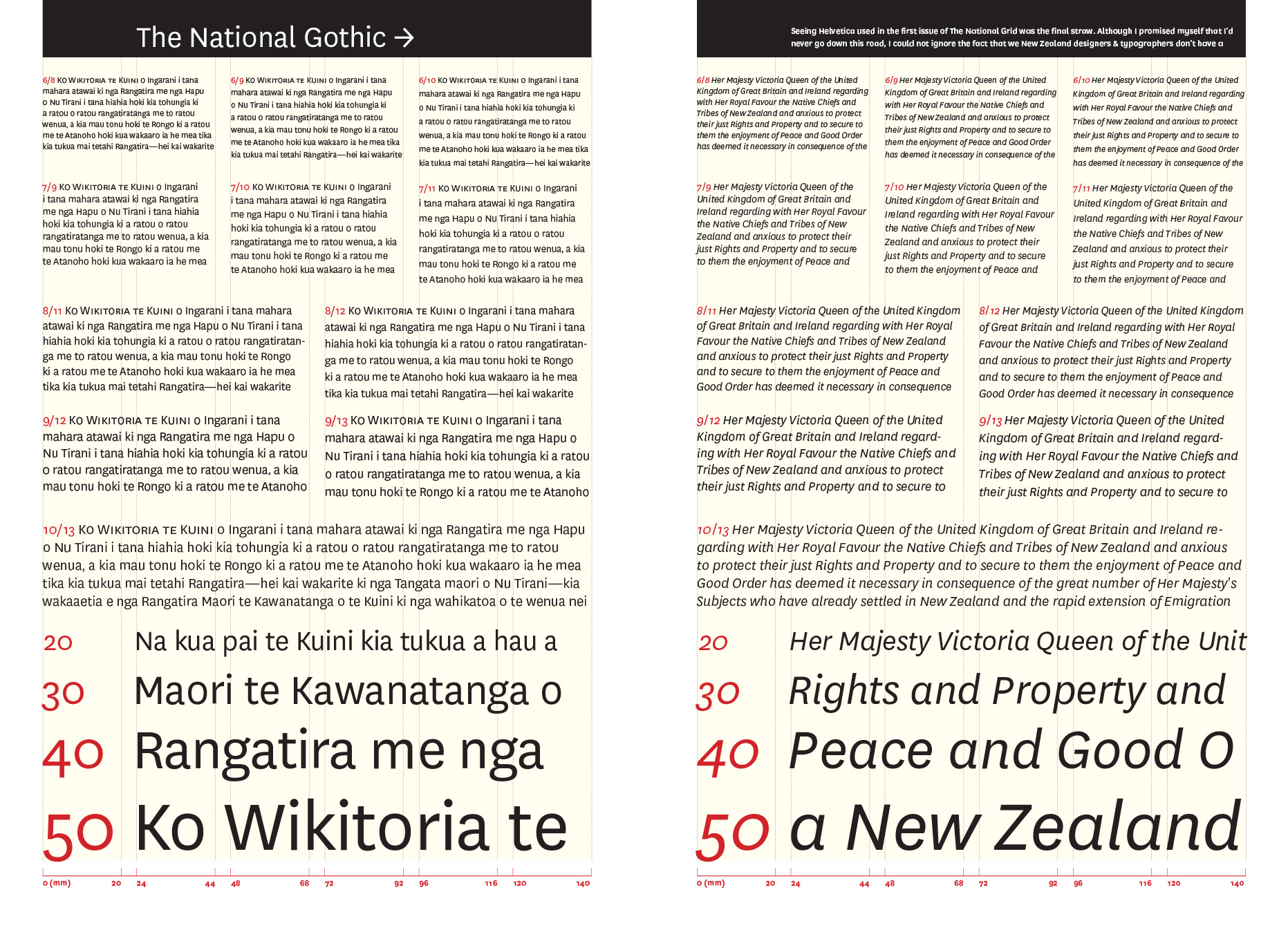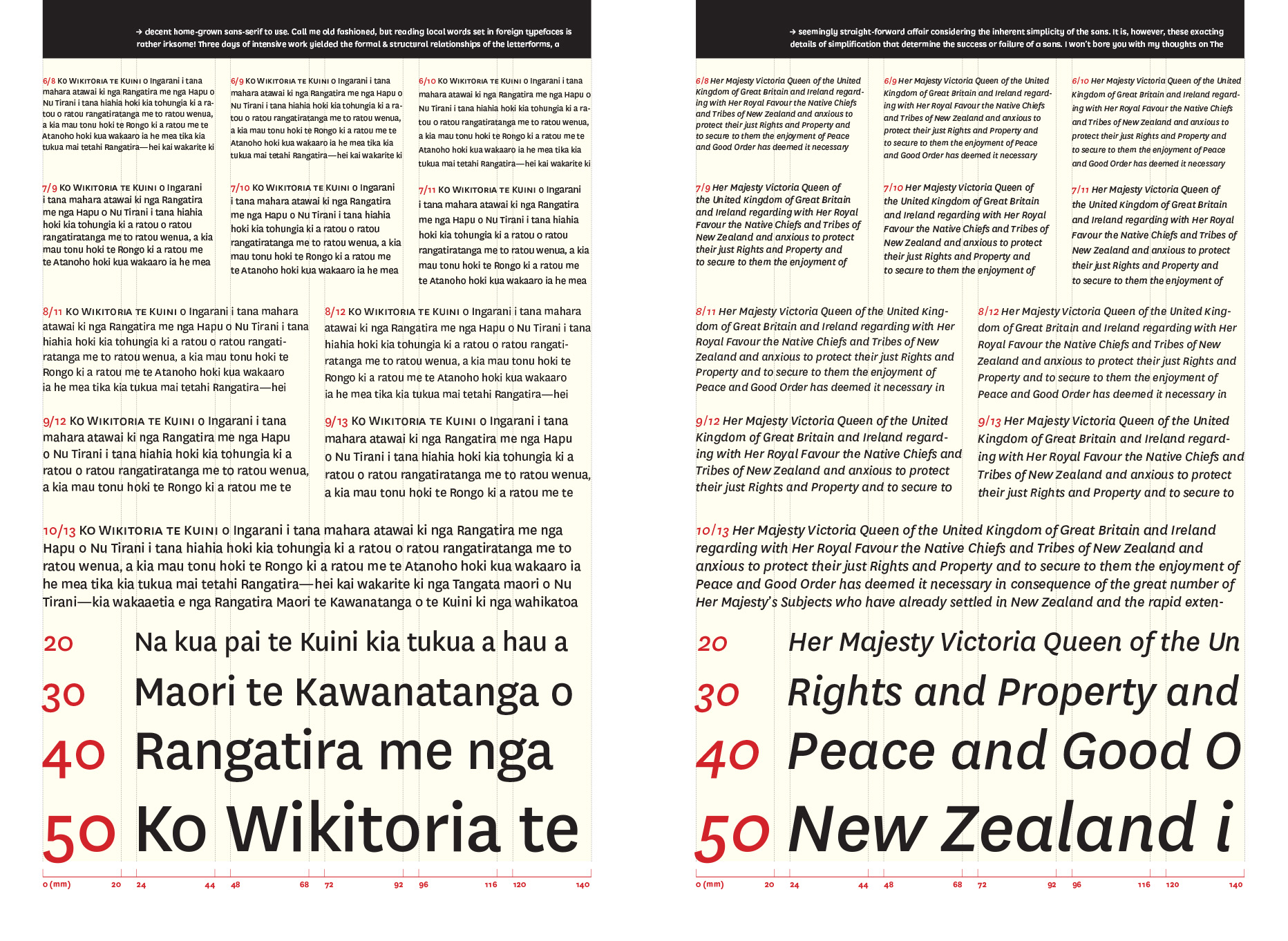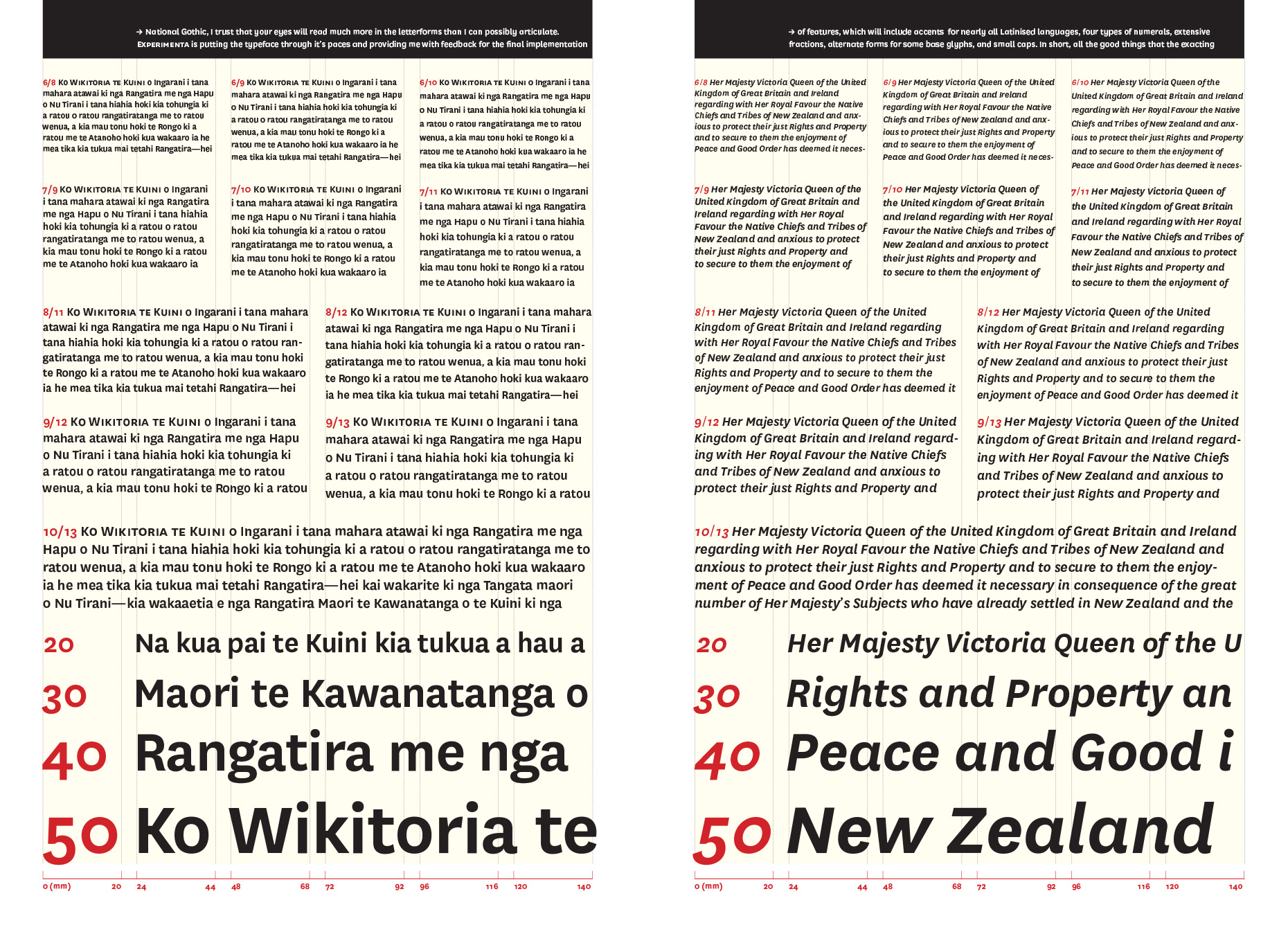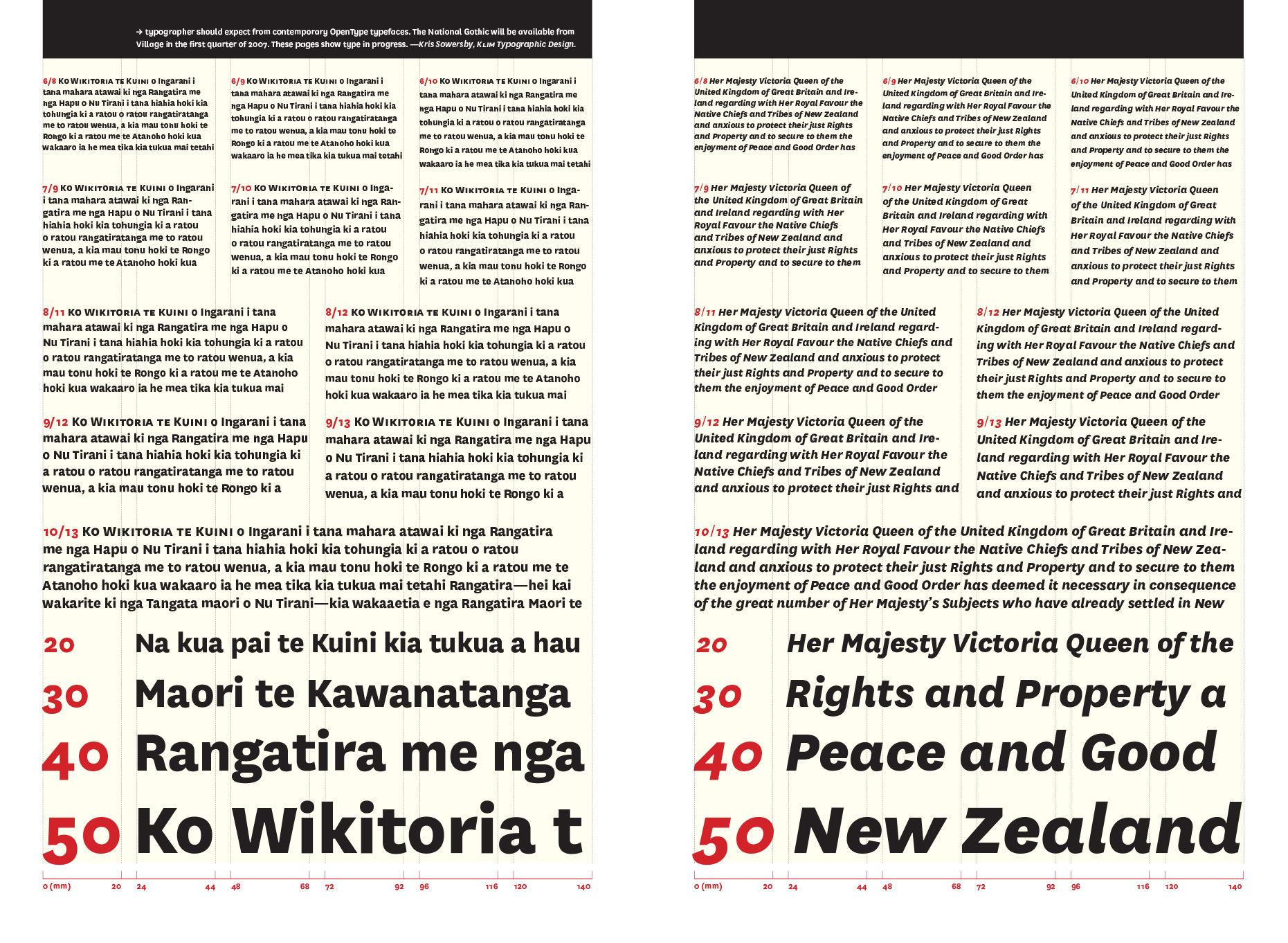
The National Gothic – Kris Sowersby
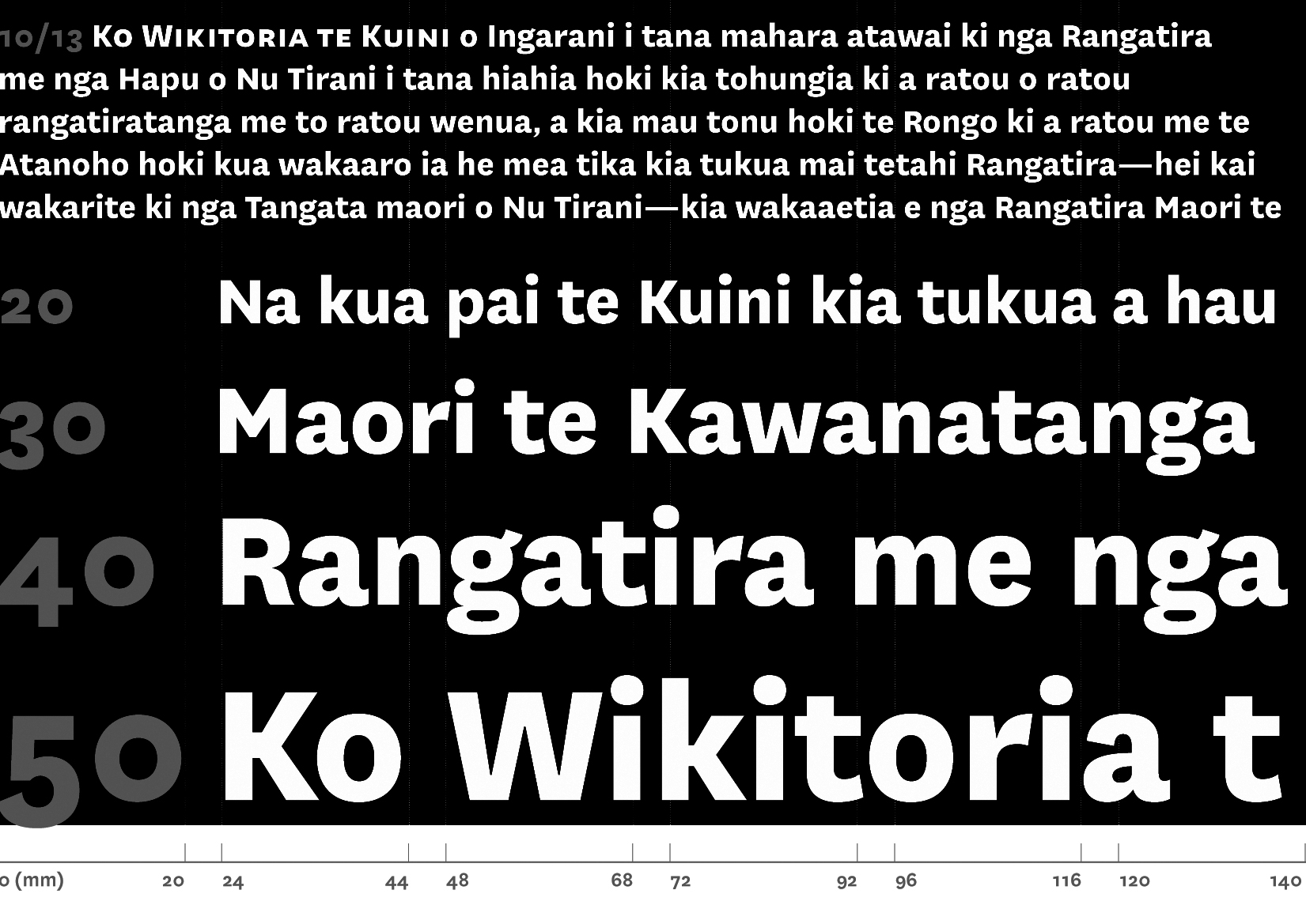
Seeing Helvetica used in the first issue of The National Grid was the final straw. Although I promised myself that I’d never go down this road, I could not ignore the fact that we New Zealand designers & typographers don’t have a decent home-grown sans-serif to use. Call me old fashioned, but reding local words set in forgein typefaces is rather irksome! Three days of intensive work yielded the formal & structural relationships of the letterforms, a seemingly straight-forward affair considering the inherent simplicity of the sans. It is, however, these exacting details of simplification that determine the success or failure of a sans. I won’t bore you with my thoughts on The National Gothic, I trust that your eyes will read much more in the letterforms than I can possibly articulate. Experimenta is putting the typeface through it’s paces and providing me with feedback for the final implementation of features, which will include accents for nearly all Latinised languages, four types of numerals, extensive fractions, alternate forms for some base glyphs, and small caps. In short, all the good things that the exacting typographer should expect from contemporary OpenType typefaces. The National Gothic will be available from Village in the first quarter of 2007. These pages show type in progress.